
Colour in
feng shui

A history of feng shui and an atlas of nineteen colours for understanding how art changes the light, scale and rhythm of an interior.

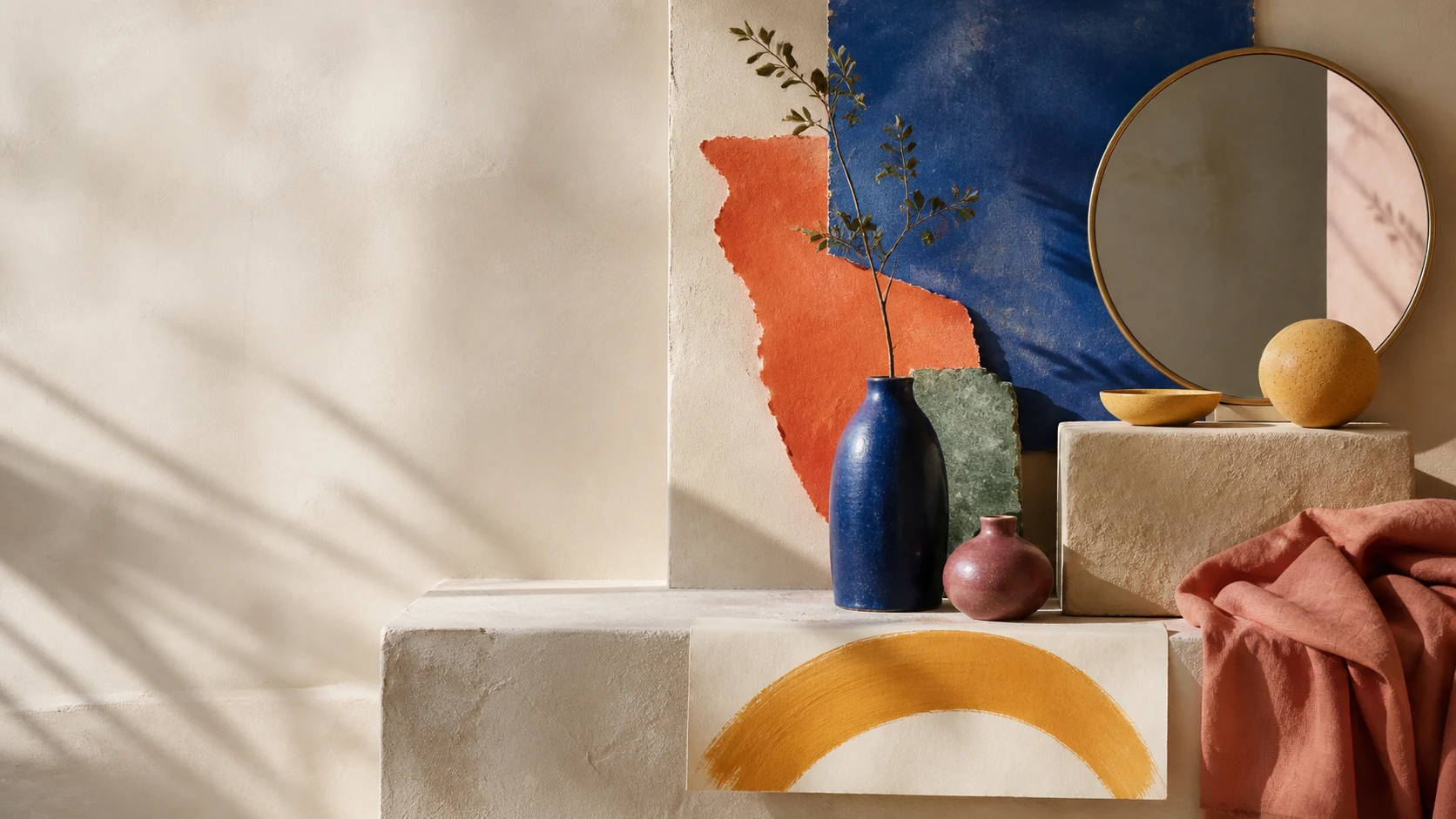
Still life with cobalt blue, orange, pink, green and ochre objects in a warm interior
Colour changes with light, scale and everything placed around it.

A history of place

Long before it became an international language of interiors, feng shui was a Chinese way of studying terrain: its mountains, watercourses, winds, orientations and patterns of inhabitation.

Its history does not begin in a single year or book. It grew over centuries, from early practices of choosing a place into systems capable of ordering a tomb, a house, a garden or a city. Colour entered that network as a relationship between direction, matter, season, light and use.

Before it had
one name.

Practices related to feng shui appear among the earliest recorded Chinese traditions of observation and divination. They carried different names—including xiangzhai, kanyu and dili—and belonged to a wider cosmology. Archaeological evidence shows that topography was already examined carefully when Shang-period settlements were established, but it does not supply an exact date of origin.

During the Han dynasty, from 206 BCE to 220 CE, these ideas gained more definite forms. They were connected with the calendar, cardinal directions, yin and yang, and the reading of terrain. Historians cannot establish whether choosing sites for dwellings came before choosing burial sites: both strands accompanied the practice as it developed.

The expression literally means “wind and water”. Its classic explanation appears in the Zangshu, or “Book of Burial”, traditionally attributed to Guo Pu, who lived from 276 to 324. The text describes qi as dispersing in wind and being retained by water. Guo Pu did not “invent” feng shui; his name became attached to an influential formulation of earlier knowledge.

From landscape
to city.

The name feng shui became common during the Song dynasty, from 960 to 1279. By then two broad approaches had crystallised. The Form School read mountains, valleys and watercourses; the Compass School worked with directions, calculations and the luopan, an instrument made of concentric rings.

The practice never belonged only to the domestic interior. It was used to site tombs, homes, temples, palaces, gardens and villages; it also informed the planning of capitals and public works. The scale changed, while the question remained: how might a construction be placed within the visible and invisible forces of its setting?

Within this thought, qi names matter or vital breath in circulation; yin and yang describe complementary modes that change into one another. Wuxing means “five phases” or “five processes”: wood, fire, earth, metal and water. These are dynamic states rather than five fixed substances.

The phases were associated with seasons, directions and colours. Blue-green corresponded to wood; red to fire; yellow to earth; white to metal; and black to water. That historical core now sits within a much broader palette.

From territory
to interior.

Feng shui continues as a cultural practice in China and elsewhere in Asia, and circulated widely beyond its place of origin during the twentieth century. On that journey it was often compressed into quick rules. Its history offers a richer reading: every decision depends on a particular relationship between place, orientation, use and time.

In contemporary architecture it can enter at the scale of site choice and building position, then continue through the entrance, routes, plan and furniture. In an interior, that attention shifts towards light, views, scale, materials and colour.

A painting gathers all of these variables. Pigment absorbs or returns light; format alters the proportion of a wall; texture changes through the day. The same work therefore reads differently against white plaster, dark timber, stone or a saturated textile.

Colour begins in pigment, then becomes complete in the light, scale and materials around it.

An atlas
for looking
at colour.

The five historical correspondences are a starting point; everyday life works with many more hues. This atlas gives every colour the same sequence and asks the same questions: what temperature does it hold, how much visual weight does it acquire, and how might it enter a work of art and an interior?

  • Apricot

    Apricot brings orange and cream together at a soft, warm temperature. Its proximity to skin tones, pale clay and ripe fruit gives it material presence without the intensity of pure orange.

    In a painting it sits easily beside linen, pale timber and warm stone. Deep blue or black gives apricot a sharper outline and a more graphic quality.

  • Turquoise

    Turquoise occupies the interval between blue and green, and changes character with the amount of light. It may recall water, glazed ceramics or oxidised metal.

    A turquoise painting establishes a clear focal point while retaining visual lightness. It works especially well beside sand, terracotta, honey-toned timber and warm whites.

  • Light blue

    Light blue reflects more light than deeper blues and tends to recede visually. Broad fields of the colour can extend the sense of air around a form.

    In art it converses with white, pale timber, steel and glass. A dark edge or precise frame keeps it from dissolving against a very bright wall.

  • Burgundy

    Burgundy is red darkened towards brown or violet. It retains the intensity of red but concentrates it in a denser, less immediate surface.

    A burgundy work holds a pale wall and settles among stone, cream and dark timber. At large scale it becomes an anchor; in small marks it introduces depth.

  • Yellow

    In the five phases, yellow corresponds to earth and the centre. It has high visual visibility: it gathers light and brings forms forward.

    A small yellow area can organise an entire composition. Ochre and mustard integrate readily with natural materials; pure yellows create a cleaner accent.

  • Green

    The historical territory of qing, between green and blue, was linked with the wood phase and the east. Its family stretches from grey leaves to highly saturated greens.

    In a painting, green can continue the tones of plants, timber and stone or break from them as a graphic gesture. Saturation decides whether it settles or dominates.

  • Gold

    The way gold reads depends on its finish. Matte gold approaches ochre and earth; a reflective surface responds to changing light and appears closer to metal.

    Within a painting or frame, it changes through the day. A small amount is enough to connect pigment, brass, timber and reflections without turning them into one block.

  • Brown

    Brown is the material colour of earth, timber, leather and many mineral pigments. Pale browns bring continuity; dark browns add weight and edge.

    In a timber-rich interior, a brown painting needs contrast in value, texture or temperature. Blue, off-white or pink allows it to appear more distinctly.

  • Red

    Red corresponds to fire within the five phases. It advances in the visual field and establishes an immediate point of attention.

    Scale changes everything: a broad red plane dominates the wall; a small mark sets the rhythm. Blue, white and earthy tones can modulate its intensity.

  • Lemon yellow

    Lemon yellow is cooler and sharper than ochre or mustard. Near green it retains freshness; beside red it produces a more vivid tension.

    In a painting it acts as a precise accent with cobalt, black and white. Sunlight increases its presence, so it is worth observing under artificial light as well.

  • Olive green

    Olive mixes green with yellow and brown. Its muted character brings it close to natural pigments, dried leaves, ceramics and dense fabrics.

    An olive painting can connect cool and warm areas of a room. It links with brass, terracotta and timber, while white or pink supplies contrast.

  • Orange

    Orange combines the visibility of yellow with the force of red. Vivid orange reads graphically; burnt towards terracotta, it acquires a more mineral presence.

    In a work of art it creates a warm focal point beside stone, concrete or timber. Blues and turquoises intensify the contrast; ochres make it more continuous.

  • Purple

    Purple mixes red and blue with a warm lean towards red. Its visual density increases as the tone darkens or the surface becomes matte.

    In painting it holds combinations with cream, gold and deep green. In a neutral interior, one purple area may establish the chromatic character of the whole.

  • Pink

    Pink ranges from powdery hues to fuchsia. The former soften contrast; the latter behave as fully graphic colours.

    In a painting, pink with brown creates an earthy relationship; pink with red builds continuity; pink with blue opens a cooler, brighter opposition.

  • Blue

    The blue family runs from brilliant cobalt to nocturnal tones. Deep blues create visual distance; saturated blues maintain a firm presence on the wall.

    A blue painting contrasts with warm timber, terracotta and orange. Against white or grey, edge and texture determine whether the composition reads as crisp or atmospheric.

  • Violet

    Violet joins red and blue with a cooler lean than purple. Dark violets absorb light; lavender returns it more softly.

    In a work it can connect the warm and cool areas of a palette. A pale wall, off-white or ochre leaves room for its undertones to remain visible.

  • White

    Within the five phases, white corresponds to metal and the west. It is never completely empty: it reflects nearby colours and exposes every change in surface.

    A white-dominant work needs a difference of texture, shadow or edge to separate from the wall. With black it defines; with cream it makes a quieter transition.

  • Grey

    Grey is a neutral that responds to its surroundings: it may lean towards blue, green, violet or brown. Its temperature becomes clearest through comparison with other materials.

    In a painting it links competing colours and gives texture room to lead. Contrast, raking light and tonal variation keep a grey palette from becoming flat.

  • Black

    Black corresponds to water and the north within the five phases. It creates the highest contrast with white and can act as outline, pause or depth.

    A small black area structures a composition; a broad field absorbs the gaze. Gloss, matte finish and lateral light radically alter its surface.

Art changes
the measure
of colour.

A blue wall fills the whole field of vision. A blue painting can open a pocket of depth within it. That difference makes art a precise way to test a chromatic direction without turning it into a total solution.

Scale
The larger the work, the closer colour comes to having an architectural presence.
Saturation
A pure hue demands attention; a muted version of the same hue settles more readily among materials and textiles.
Surface
Gloss, glazing, impasto and weave alter the way colour receives and returns light.
Frame and distance
An edge can separate the work from the wall or connect the two. Viewing distance changes the weight of every colour field.

How to choose
art through
colour.

Begin with the actual room and the visual role it needs. Then use the five phases as a vocabulary of relationships rather than a catalogue of promises.

  1. Define the role. Decide whether the work should activate, bring the room together, anchor, expand or add depth.
  2. Take inventory. Note the daylight, orientation, timber, stone, metals, textiles and colours that are already fixed.
  3. Choose the intensity. A broad red field and a small vermilion mark belong to one family but establish very different rhythms.
  4. Test the light. Look at the work in the morning, late in the day and under artificial light before fixing its position.
  5. Create a connection. Repeat one tone from the painting once—in an object, textile or flower—to tie it into the whole.

Bringing colour into the room

Find the work that creates the right relationship.

Explore the available selection, or tell us about the light, materials and atmosphere of your space. We can help you compare formats, palettes and ways to install the work.