A reading of this version
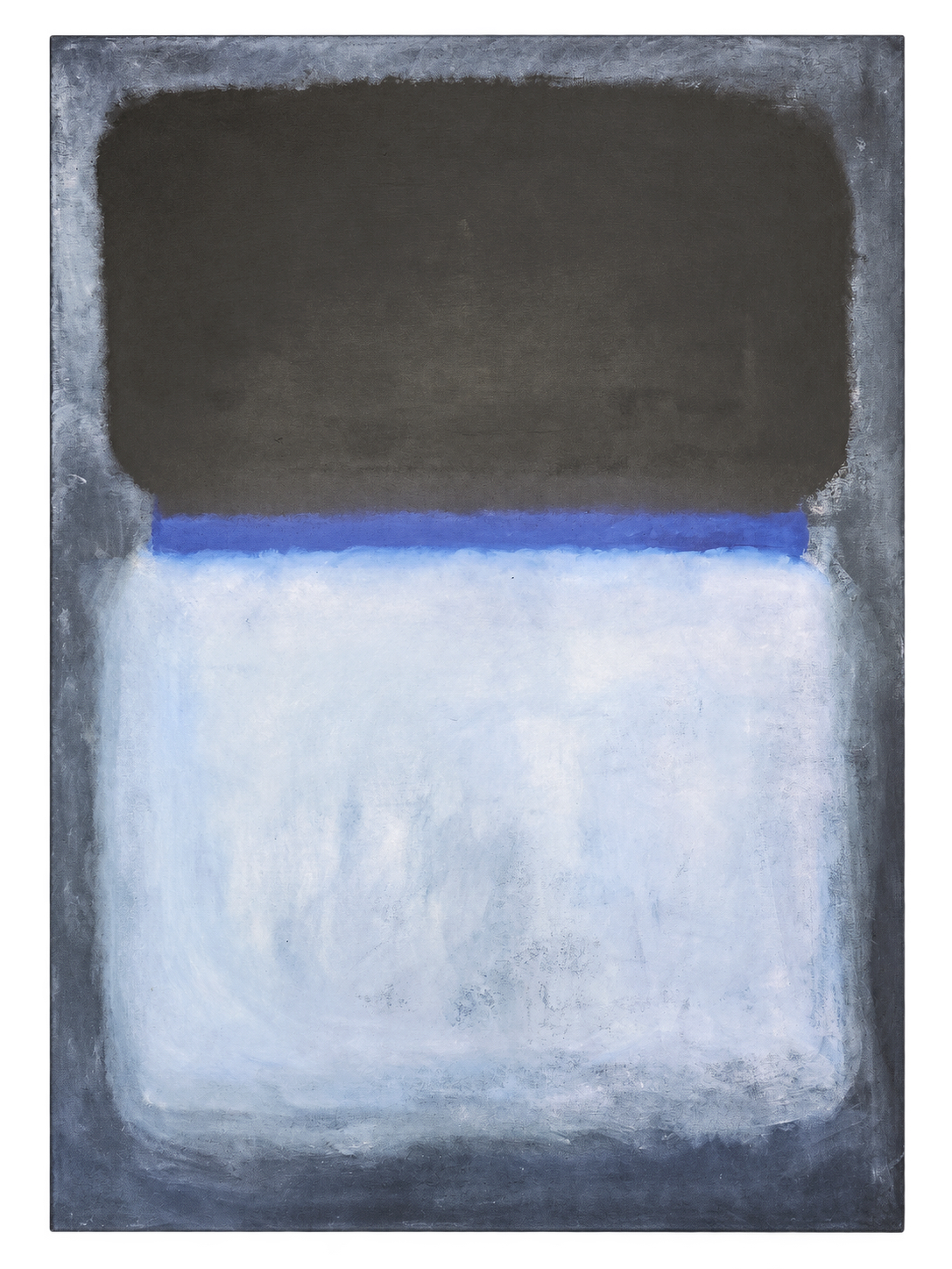
Belonging to the same colour family, the dark field and its surroundings seem to share a common depth. The eye finds less chromatic distance between them and may perceive the upper area as an opening that extends inwards. This reading heightens a sense of inward attention.
By contrast, the lightness of the lower field acquires a sense of closeness. It offers a point of orientation within that space and retains a certain fragility beside the dark expanse. The more intense blue band between the two fields concentrates the tension of the composition. It can feel like an interval that keeps light and darkness close without either fully absorbing the other.
The soft boundaries make it difficult to fix the depth of each area. As the eye moves over the surface, the light area may seem to advance and the blue to recede, although the painting remains still. This apparent movement allows calm to be read as a balance that takes shape through looking and remains fragile.
The reference painting
Rothko’s reference painting was made in oil and belongs to the University of Arizona Museum of Art, which received it as a gift from Edward Joseph Gallagher Jr. In its educational commentary on the original, the museum explains that Rothko sought to establish a physical and emotional relationship between the painting and the viewer.University of Arizona Museum of Art University of Arizona Museum of Art