
SEARCHING FOR A UNIVERSAL LANGUAGE
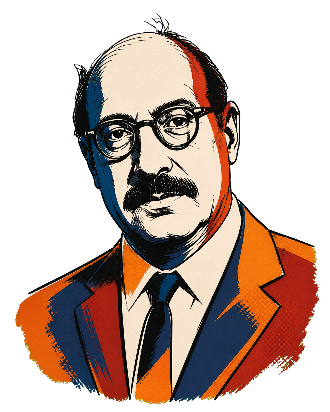
Rothko was born Marcus Rothkowitz on 25 September 1903 in Dvinsk, then part of the Russian Empire and now Daugavpils, Latvia. In 1913, when he was ten, his family emigrated to the United States and settled in Portland, Oregon. During the 1930s and 1940s, Rothko worked figuratively, painting scenes of urban life as well as symbolic and mythological compositions. He was searching for a universal language of emotion, drawing on ancient myth, the ideas of Freud and Jung, and the philosophy of Nietzsche.
His paintings absorbed the tragic atmosphere of their time. Rothko experienced the catastrophe of the Second World War as evidence of a profound human collapse. Even then, he wanted painting to communicate elemental states: tragedy, ecstasy and the sense of fate. Gradually, he came to believe that narrative prevented those emotions from speaking with sufficient force.
By 1949, Rothko had arrived at the visual language for which he is now recognised. Figures and symbols receded. In their place appeared rectangles of colour that seem to hover against an open ground. The approach would later be described as Colour Field painting, although Rothko resisted labels. Colour itself was never his final subject; what mattered was the experience it awakened in the viewer.
“A picture is not a representation of an experience. It is an experience,” he said. If a viewer saw only composition, proportion or attractive colour harmonies, Rothko believed that the essential encounter had been missed.
ROTHKO CANNOT BE EXPERIENCED THROUGH A SCREEN
We live within an endless stream of images. Reproductions of major works are available instantly, reduced to the same illuminated surface as advertisements, messages and photographs. Rothko is one of the artists whose work is fundamentally altered by that reduction.
He wanted colour to surround the viewer. His canvases were conceived for a close, almost physical encounter, large enough to occupy the field of vision. Their scale is not theatrical decoration; it determines the relationship between the painting and the body standing before it.
Colour in these works does not simply sit on the surface. Rothko built it through many thin layers of paint. These translucent passages absorb and reflect light differently, producing an impression of depth and internal illumination. A reproduction preserves the approximate arrangement of colours but loses their changing vibration, their material density and their response to the light in the room.
Only in front of the actual canvas—and only after giving it time—does the viewer begin to understand what Rothko believed painting could do. “The people who weep before my pictures are having the same religious experience I had when I painted them,” he once observed.
PAINTING AS A SPACE OF CATHARSIS
In White Center (Yellow, Pink and Lavender on Rose), painted in 1950, yellow, pink, white and lavender appear suspended within a larger field of colour. Their boundaries remain soft and unstable. The painting never settles into a single optical reading: one area comes forward, another recedes, and the whole surface seems to expand and contract.
The emotional range of Rothko’s mature work is remarkably broad. Some paintings feel open and luminous; others generate an almost physical unease. He achieved these shifts with deliberately limited means, adjusting scale, density, interval, proportion and the pressure of one colour against another. Colour becomes an event rather than a property—something the viewer enters and cannot remain entirely outside.
THE ROTHKO CHAPEL: PAINTING AS A SPIRITUAL ACT
The culmination of this search is the Rothko Chapel in Houston, an octagonal building containing fourteen dark paintings. It is neither a conventional museum nor a traditional religious building. Dominique and John de Menil, who commissioned it, envisioned a sacred place belonging to no single faith: a space for silence, reflection and encounter.
Rothko did not merely supply paintings for an existing interior. He took an active role in shaping the chapel itself, discussing its architecture, controlling the quality of the light and considering how a visitor would enter into relation with the works.
The paintings are dominated by deep purples, browns and colours approaching black. Yet the darkness is not empty. As the eye adjusts, differences emerge: edges shift, surfaces pulse and one field separates slowly from another. The chapel became the final expression of Rothko’s thinking about spirituality in art.
He did not seek conventional religious imagery. He sought an experience comparable to contemplation or mystical attention. In this sense, his paintings can be compared with icons not because they depict sacred figures, but because of the function they ask the image to perform. They are not illustrations. They are thresholds. They demand inward concentration and resist the casual glance.